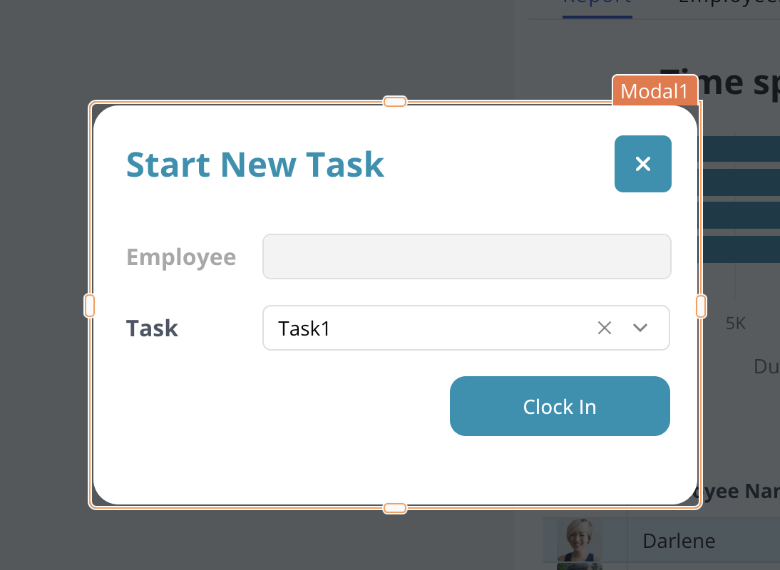
Modal
This page provides information on using the Modal widget to create a dialog in your app for displaying various types of content, such as alerts, confirmation pop-ups, forms, and more. It acts as a container used to group and handle related user inputs , and can be opened using actions such as setting a Button widget's onClick event.

Content properties
These properties are customizable options present in the property pane of the widget, allowing users to modify the widget according to their preferences.
General
General properties are essential configurations that provide overall control over the widget's behavior and appearance.
Animate Loading boolean
This property controls whether the widget is displayed with a loading animation. When enabled, the widget shows a skeletal animation during the loading process. Additionally, you can control it through JavaScript by clicking on the JS next to the property. The default value for the property is true.
Quick Dismiss boolean
Enables quick dismissal or closure of the Modal when the user taps outside the Modal.
Height string
This property determines how the widget's height adjusts to changes in its content. There are three available options:
- Fixed: Maintains a constant height for the widget, allowing you to adjust it by dragging or using the resize handle.
- Auto Height: The widget's height adjusts dynamically in response to changes in its content.
- Auto Height with limits: Same as Auto height, with a configurable option to set the minimum and maximum number of rows the widget can occupy.
Events
Events are properties that allow you to define actions or responses based on user interactions or widget state changes.
onClose
Specifies the action (Framework functions, queries, or JS functions) to be performed when the Modal is closed.
Style properties
Style properties allow you to change the look and feel of the widget.
Color
Background Color string
Sets the background color of the widget, specified as a CSS color value. It can also be manipulated programmatically using the JavaScript functions.
Border and shadow
Border radius string
Applies rounded corners to the outer edge of the widget. If JavaScript is enabled, you can specify valid CSS border-radius to adjust the radius of the corners.
Reference properties
Reference properties are properties that are not available in the property pane but can be accessed using the dot operator in other widgets or JavaScript functions. They provide additional information or allow interaction with the widget programmatically. For instance, to get the visibility status, you can use Modal1.isVisible.
isVisible boolean
Reflects whether the widget is visible or not.
Example:
{{Modal1.isVisible}}
name string
Reflects the widget name of the Modal.
Example:
{{Modal1.name}}
Update data with Modal
The Modal widget can be used to view and edit data in a table. By displaying the details of a selected row in the Modal, users can easily make changes to the data. To open or close the Modal widget, you can make use of event listeners.
-
Fetch data from the sample users database using a SELECT query
fetchUserData. -
Display the data by binding the query response to the Table Data property of the Table widget
tblUserData, as shown below:
{{fetchUserData.data}}
- Set Table's
onRowSelectedevent to open a Modal widget, you can create a new Modal widget or select an existing one
Modal widget remains hidden on the canvas and becomes visible only when an event is triggered. You can access and edit the Modal widget from the entity explorer.
-
Next, add JSON form inside the Modal widget, and edit the fields. For instance, if you plan to modify a user's
Date of BirthandEmail, you can edit the JSON Form widget accordingly. -
Create a new
updateuserdataquery, to update the database:
UPDATE users
SET email = {{JSONForm.formData.email}}, dob = {{JSONForm.formData.dob}}
WHERE id = {{tblUserData.selectedRow.id}};
-
Set the JSON form's
onSubmitevent to run theupdateuserdataquery, which updates thedobandemailfields of a specific user in the users' table based on the provided user ID. -
To close the Modal, configure the onSuccess event to include a Close Modal action. This would close the Modal once the
updateuserdataquery has been successfully executed.
See also
- Insert Data - Learn how to insert data into a Table widget, including setting up data sources and handling user input.
- Update Form Data in Modal - Discover how to update and submit form data within a Modal widget.
- Edit Table Data Inline - Find out how to edit table data directly within the Table widget, allowing for real-time changes.
- Display and Lookup Data in Table - Learn how to display, search, and filter data in a Table widget to make data management more efficient.
- Create Data Drilldown View - Understand how to create a drilldown view to explore data in detail using a Table or other data widgets.